The Challenge
Create a brand new website to appeal to a wide ranging audience.
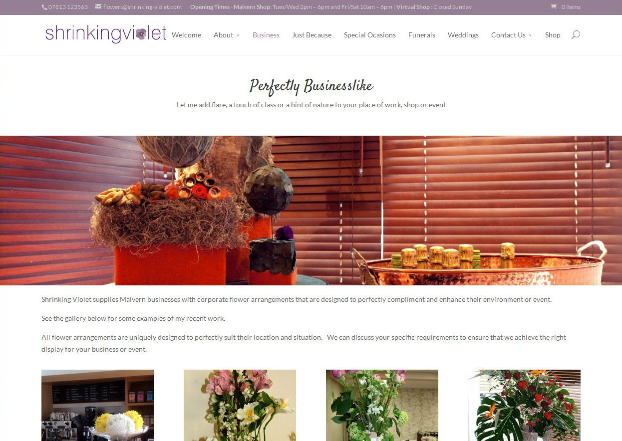
Lucy, owner of Shrinking Violet Bespoke Floristry, wanted a website that was modern and striking. A site that would set her apart from local small florists and stand toe to toe with some of the larger national organisations.
She was looking for a website that could showcase her amazing passion and talent for floristry and keep customers up-to-date with her progress, offers and news. Later she wanted to add an e-shop to allow customers to place orders for some of her more regular products 24/7.
One of the biggest challenges with Lucy’s website is that everything she does is bespoke. Wherever possible she works with seasonal flowers and creates to her client’s requirements. So, unlike some of the larger florist websites, there is no ‘one-size fits all’ attitude here. Everything needs to be demonstrating Lucy’s talent and representing her unique style. This presented considerable issues with regards to the e-shop, where I had to find a way to enable customers to buy an entirely bespoke product at standard prices.
The Solution
From the start the focus was on creating a very image-led website and let the beautiful floral arrangements Lucy creates speak for themselves. Due to the wide audience that Shrinking Violet Bespoke Floristry appeals to it’s essential that this website is clear and easy to navigate, for even the least web savvy user. In an industry as competitive as floristry, we couldn’t afford to lose people due to a complex and frustrating website.
I also wanted to ensure that Lucy’s unique history, passion for floristry and talent infused the entire website. In essence I wanted to create a website as unique and bespoke as Lucy’s flowers!
The result was a website that allows visitors to get a quick feel for the services Lucy provides. The menu clearly defines her areas of specialisation and those sections offer an overview of the sorts of arrangements customers can expect using photographs of previous work.
The shop offers an array of examples of Lucy’s work. The focus is on providing examples of Lucy’s style and perhaps a little inspiration. Shoppers can select a type of bouquet or arrangement and size and let Lucy do what she does best, or if they have more specific requirements there is space to express that.
Although the news section of the website is secondary, we felt that it would add value to provide regularly updated news. On behalf of Lucy, I write all the website content. Drawing on her expert knowledge I have written pieces on flower care, vase choice, wedding flowers, show-cased a number of specific flowers and of course any competition and business news. As well as providing added value for the website itself, these news stories also provide shareable content for use on the Facebook and Google Plus pages.
