The Challenge
Dr Jack Darby from MediFit approached me to design his website as he launched his new personal training business.
Jack’s offering is different from the usual personal trainer in that, as a trained Doctor and nutritional expert he has the knowledge and background to provide a truly holistic approach to helping his clients achieve their health and fitness goals.
As it was early days for MediFit the design of the website would set the tone for his business going forward. We had a logo to start with, but no other marketing collateral. It was a totally blank page!
Extremely enthusiastic about his product, Jack had a lot of ideas about how he wanted to present himself and his services to the waiting world. My challenge was to take those ideas and translate them into a functional and professional looking website.
It was also essential to be able to clearly describe MediFit’s offering so that future client’s would properly understand the unique and expansive service that Jack offers.
Finally, MediFit has a number of expansion opportunities and the website had to be ready to grow as and when those opportunities can be realised.
The Solution
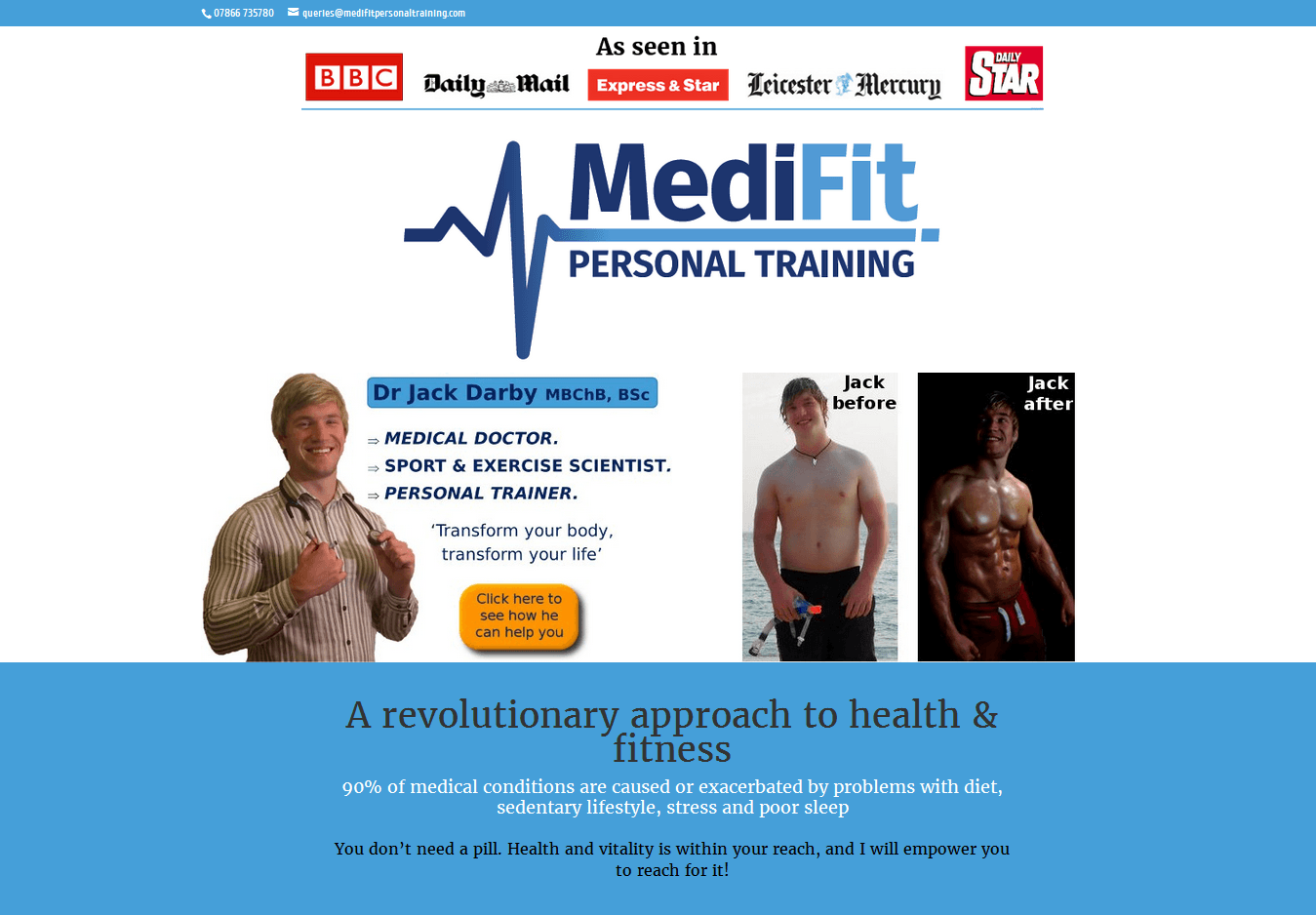
The website’s look and feel was dictated largely by the blues of the MediFit logo. I chose the orange colour to act as a highlight to lift the website and give energy.
The heartbeat line of the logo provided a good symbol that could be used throughout the site to tie it together whilst also working well as a page header.
I had to keep text to a minimum and engagement up whilst not compromising on detail. To achieve this I used a lot of graphics, graphs and charts to describe the services offered by MediFit in a visual way. Information can be quickly accessed without needing to read through pages and pages of text.
The text lightness and visual elements of the website reflect Jack’s enthusiasm and style. They are informative and knowledgeable, but the site, like MediFit, is about stripping back the fiction and achieving goals.
